Painting with Light: Wynn Bullock’s Color Light Abstractions, 1959/1960–65
Catherine Barth

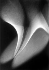
Wynn Bullock (American, 1902–1975), Color Light Abstraction 1185, 1964, dye coupler print. Promised gift to High Museum of Art from Barbara and Gene Bullock-Wilson.

In 2014, the High Museum acquired eight vintage color chromogenic prints by American photographer Wynn Bullock from a series he called Color Light Abstractions1 as well as being gifted a set of inkjet prints of the color light abstractions produced by the estate from Bullock’s original 35mm Kodachrome slides.2 The modern inkjet prints were exhibited recently in a retrospective at the High, Wynn Bullock: Revelations (fig. 1), the first major exhibition in which Bullock’s color work has been shown alongside his black-and-white prints. Bullock made color light abstractions exclusively from 1960 to 1965, creating pictures of what he called “pure light.”3 However, given his lack of experience in developing color film and the status of color photography in the 1960s, Bullock found it difficult to both present and find an audience for his experimental works.4 It was not until 1976, with the opening of William Eggleston’s one-man show of color photographs at MoMA, that color photography was accepted as a fine art form, separate from its commercial origins.5 Throughout his career, Bullock’s color work, created more than a decade before the Eggleston show, was still dwarfed by his black-and-white photographs. To this day almost no scholarship exists on the color light abstractions. With this introductory study, I hope to clarify Bullock’s reasons for making the color works and to illustrate his method for creating them. In my paper, I will focus on subject matter, artistic influences, forms of production, presentation, and current condition to argue that Bullock’s period of color work was not merely a transitional moment but a significant chapter in his artistic career and that special care should be taken to preserve these photographs for future generations of viewers.
Wynn Bullock did not begin to photograph seriously until the age of thirty-six.6 As a young man, he had toured Europe in a concert troupe and studied vocal music in Paris, where he first encountered the canvases of the Impressionists and photographs by Man Ray and László Moholy-Nagy (figs. 2–3).7 Later, Bullock managed his in-laws’ real estate properties8 and attended law school, though he never finished.9 Finally, in 1938, he began photography classes at the Art Center School in Los Angeles, and his photographic career took off from there.10 Bullock met Edward Weston in 1948, and learned the basics of straight photographic technique.11 His training with Weston places him squarely within the West Coast tradition, though Bullock’s name is often omitted from this canon—likely because of his late entrance to this photographic circle and his unique aesthetic. His photographic style, in particular, developed into something that was much different than what one sees in the work of Weston or Ansel Adams. As Brett Abbott, Curator of Photography at the High Museum, writes, “If Weston’s interests were in the geometric aspects and universality of form, and Adams’s lay in portraying a heightened grandiosity of nature, Bullock’s efforts were decidedly pointed toward making the ordinary profound and in revealing a complexity beyond the surface of things.”12
-

Fig. 2. Wynn Bullock in costume, Music Box Revue, 1923. Image courtesy Bullock Family Photography LLC.
-

Fig. 3. László Moholy-Nagy, Photogram, 1923, gelatin silver print. © 2019 Artists Rights Society (ARS), New York/VG Bild-Kunst, Bonn. © 2019 Artists Rights Society (ARS), New York/VG Bild-Kunst, Bonn.
The idea of “revealing … complexity beyond the surface of things” is clearly at play in Bullock’s color light abstractions. Photographers and artists in the early twentieth century drew heavily upon Albert Einstein’s theories in his 1905 Special Theory of Relativity, which describes the forces at work behind what is visible.13 As Lyle Rexer notes: “The purpose of both science and art, then, in the modern sense, is to discover the reality that lies hidden behind, beneath, or beyond appearances.”14 As further research on Bullock’s color light abstractions shows, he too was finding ways to apply new scientific discoveries to art. “Photography,” he wrote, “the greatest visual form of communication of our century, faces the challenge of expressing these [scientific] changes.”15
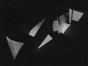
Although Bullock did not start experimenting with color film until 1959 or 1960, he demonstrated an early interest in light abstractions.16 This is evident from a black-and-white abstraction he made in 1939, just a year after he began photographing professionally. Light Abstraction, 1939 (fig. 4), is composed entirely of two curved, wing-like shapes. In its subtle gradations of white and gray and use of abstract forms, the photograph shares a close resemblance to Moholy-Nagy’s Photogram of 1923 (see fig. 3). Bullock explored other experimental photographic processes relatively early in his photographic career as well. These included reticulations, solarizations, line drawings, and reversal processes, as seen in Reticulation, 1945, and Early Solarization, 1948 (figs. 5–6).17 Inspired by the writings of philosopher Alfred North Whitehead and general semanticist Alfred Korzybski, Bullock sought to portray relations between events that would generate a new “visual semantics” in photography.18 During a lecture on his color light abstractions given in Carmel, California, in 1964, Bullock said: “Time, space, line, form, color—these are the grammar of photography … these elements remain the same because they are rooted in the world of visual perception, whether we are creating pictures with pure light or photographing realistically. It is through these elements—this grammar—that we can come to understand and judge a photograph.”19
In his color light abstractions, Bullock primarily sought to explore—through time, space, line, form, and color—light as a plastic medium.20 Many of these images look like close-ups of plant life, and in early color photographs that Bullock made just before taking up the color light abstractions, one can see that he was already experimenting with the idea of the camera lens as a microscopic magnifier. Abbott comments in the Revelations catalogue: “It was through … images of the 1950s and 1960s that Bullock’s meditation on objects as ‘events constantly changing on sub-microscopic, microscopic and macroscopic levels in time and space’ became a fundamental part of his approach to photography.”21 From as early as 1959, Bullock demonstrated an interest in micro-scopic photography, and was thinking about what could be revealed about the action of light when the camera maintained a close proximity to its subject.22 While at the Center for Creative Photography (CCP) in Tucson, Arizona, this past summer, I found many 35mm slides of leaves and flowers Bullock had made with color film and taken at a relatively close range that only slightly precede the color light abstractions. Although it is still obvious that the subject of the photograph is a flower or a leaf in these slides, by the spring of ’59, Bullock had begun to shoot plant matter at even closer range, abstract-ing the subject and focusing more on the light effects and textures that could be produced. These are categorized in Bullock’s archive with a terse note: “some good, some poor, no commercial value, for lectures and personal use only.”23
-
Fig. 5. Wynn Bullock, Reticulation, 1945, gelatin silver print. Image courtesy Bullock Family Photography LLC.
-
Fig. 6. Wynn Bullock, Early Solarization, 1948, gelatin silver print. Image courtesy Bullock Family Photography LLC.
A photograph of leaves from May 1959 (fig. 7) exemplifies one of Bullock’s more abstract pictures of plant matter and reveals details that the unaided eye would not see. In the foreground of the image, a pale green leaf curls over onto a darker green leaf below it. On both leaves, small bumpy ridges are visible, as if one were looking at them through an electron microscope. This effect is also visible in another color light abstraction Bullock made in 1963, as seen in fig. 8. In the reddish-pink leaf above these two, the viewer may also notice small, red vein lines, illuminated by an ethereal light that emanates from the upper left-hand corner of the photograph. Bullock wrote that his camera was “not only an extension of the eye, but of the brain.” He added: “It can see sharper, farther, nearer, slower, faster than the eye. It can see by invisible light. It can see in the past, present, and future. Instead of using the camera only to reproduce objects, I want to use it to make what is invisible to the eye, visible.”24 He also wrote that light was “a pure expression of electro-magnetism.”25 In this early color photograph, Bullock employs the camera as a substitute for the microscope, calling attention to small details and abstracting the leaves by their closeness to the camera lens.26
-

Fig. 7. Wynn Bullock, Early Color Image 1183, May 1959, vintage color chromogenic print. Image courtesy Bullock Family Photography LLC.
-

Fig. 8. Wynn Bullock, Color Light Abstraction 2046, negative 1963, printed 2014, inkjet print. Image courtesy Bullock Family Photography LLC.
-
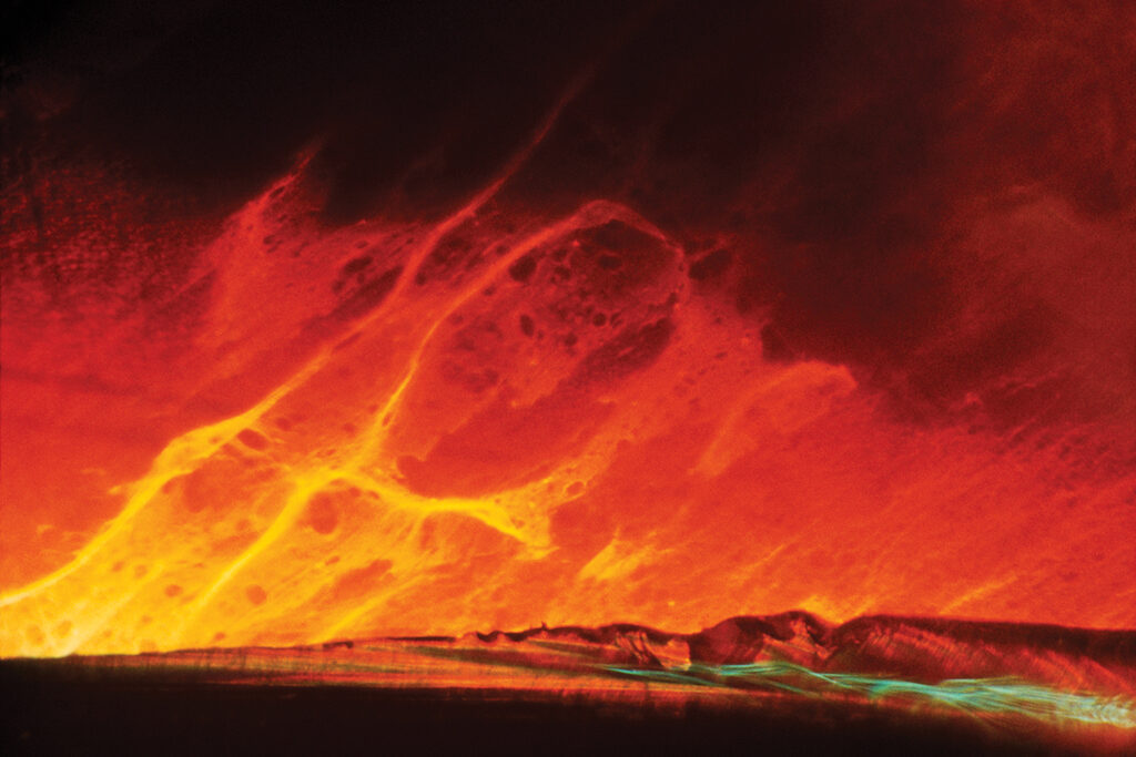
Fig. 9. Wynn Bullock, Color Light Abstraction 1076, negative 1963, printed 2014, inkjet print. Image courtesy Bullock Family Photography LLC.
In contrast to Early Color Image 1183 (see fig. 7), a number of the color light abstractions take on a macroscopic, rather than microscopic, quality. These color light abstractions seem to picture panoramic views of the solar system. The interaction of color and form in the modern print of Color Light Abstraction 1076, for example, calls to mind imagery of solar flares (fig. 9). Unlike the early color image of leaves from 1959, this photograph is more abstract; specific referents to the “object world” recede, and the energies of light and color come forward as the main subject of the photograph.27 Through the use of glass, stains, refracted light, and filters, Bullock creates a violent, fiery landscape of red, orange, and yellow light in his studio, cut through by a small aquamarine-blue zip at the bottom right corner of the image. The arc at the bottom of the photograph was likely created by a break in the glass, and it gives the illusion of a horizon from which the bright spurts of color, like solar flares flashing up from the sun’s surface, emerge. Thus, as both 1183 and 1076 show, Bullock was thinking about the full spectrum of existence when he made the color light abstractions, from life at the micro, molecular, and cellular levels to the vast galaxies of outer space.28 As the above examples illustrate, the color light abstractions as photographs were experimental works that attempted to capture the intangible and invisible qualities of the natural world on the ground glass. Bullock wrote that his pictures were intended to be “out-of-focus” so that they would lose their “object identity.”29 Instead, they were meant to represent the underlying processes behind the objects and forms we see in reality. For this reason, Bullock abandoned traditional photographic techniques as well as the standard black-and-white gelatin silver print; in fact, he was criticized by some for making color photographs that resembled abstract paintings rather than remaining true to straight photographic technique. With these experimental color works, he effectively blurred the line that divided photography as a medium from painting. In 1963, Bullock received a letter from his friend Phil Palmer, who—seemingly unaware of Bullock’s work with color light abstractions at the time—writes of his deep disdain for this kind of work in photography. In his letter, he casually remarks:
Had an interesting session at Ruth’s this week—Henry Holmes Smith was there. I hadn’t better comment on it at the moment much except for one thing—the photographers there were all showing 35mm slides, color abstractions. Some very interesting work, too. But I still find it disturbing—Wynn, dammit, why is it that the photographers are doing things which the painters have been doing for 50 years? Instead of utilizing the photo-image they, so often, simply are following—in photography—what the painters have done—and their understanding of color and form is not as great as that of the painters, it seems to me.30
Interestingly enough, just three years earlier, as Bullock was beginning his foray into abstract color photography, he wrote to an acquaintance, commenting on the color light abstractions. “From an image standpoint,” he said, “these slides stand up against the best of the modern abstract paintings.”31 Bullock thought that photographers need not be limited to black-and-white work; they could explore color and form in innovative ways through the light-based medium of photography just as well as painters. Curator John Rohrbach, in a recent exhibition that included one of Bullock’s vintage color light abstractions, also defends the photographic status of the color light abstractions: “Although he [Bullock] called his brightly hued photographs ‘abstractions,’ rather than follow painting’s trend toward flattened and compacted space, he deepened space and often deliberately obscured orientation so that even he would change his mind about which direction was up. The images are not about color, but about light and energy revealed through color.”32
As Rohrbach notes, though Bullock was using painterly effects and techniques in his color light abstractions,33 his artistic goal with these works was not to achieve the look of a flat, tacked-up canvas.34 Instead, he attempted to convey “a more malleable notion of space,” one that would reflect the twentieth-century discoveries made by Einstein about the fluidity of space and time in our universe.35 Bullock demonstrates the idea of “malleable space” in his color light abstractions by rendering forms with volume, linearity, texture, space, and depth. Bullock mimics the action of a painter in making his color light abstractions, but this is simply a compositional strategy he uses to render the invisible visible.
In addition, as Palmer’s letter reveals, Bullock was not the only photographer at the time making abstract color works. Two of his contemporaries, Henry Holmes Smith (referenced in the Palmer letter) and Harold Eugene Edgerton, were experimenting with color through the 1950s, ’60s, and early ’70s. Smith, like Bullock, was highly influenced by the work of Moholy-Nagy, whom he met in 1937.36 Also like Bullock, Smith made light abstractions in black and white before moving into color (fig. 10). He started making abstract color photographs in the late 1940s and continued this work into the 1970s.37 Henry Holmes Smith made refraction prints, or “drawings made with syrup and water,” and often combined these drawings with the dye transfer process to complete his color abstractions.38 What most profoundly distinguishes Smith’s work in color from Bullock’s is that Smith’s prints never reach the level of abstraction of Bullock’s images.
His prints all have descriptive titles that link to representational subject matter in the photographs, as in Giant and Dancers (figs. 11–12). His color photographs also usually have a distinct separation between figure and ground, whereas in Bullock’s light abstractions, especially the later ones, layers of color yield overlapping textures that overturn the figure-ground relationship. MIT scientist and engineer Harold Edgerton, by contrast, began making color photographs after Bullock, in the early ’70s, and is well known for his stroboscopic photographs (fig. 13), which he defined as “high-speed motion-picture photography” that uses “a controlled, pulsing light” to capture high-speed movements on film.39 As this description suggests, Edgerton’s technique was very different from Bullock’s, but his end goal was actually quite similar: he wanted to slow down time in his color photographs and show, through this slow motion vision, actions of physics and light that the unaided eye could not see.40 In this way, Edgerton’s photographs share qualities with Bullock’s microscopic color light abstractions.41 Overall, Smith’s quasi-painterly studio techniques more closely resemble Bullock’s method of painting with light, yet Edgerton’s photographs match Bullock’s prints more on a conceptual level, marrying scientific discovery with photography.
-
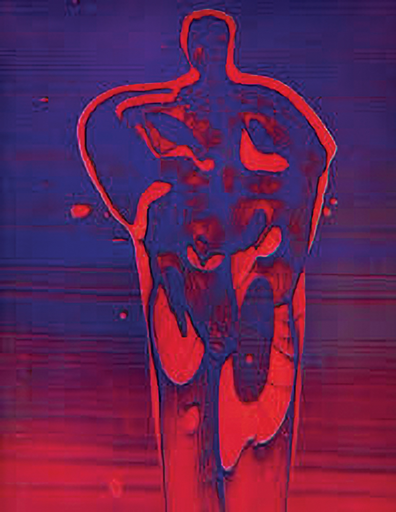
Fig. 11. Henry Holmes Smith (1909–1986), Giant, 1949, dye transfer print. Center for Creative Photography, gift of the Estate of Henry Holmes Smith. © Henry Holmes Smith Art.
-

Fig. 12. Henry Holmes Smith, Dancers, 1950–1960, dye transfer print. Center for Creative Photography, gift of the Estate of Henry Holmes Smith. © Henry Holmes Smith Art.
Other artists and photographers who may have influenced Bullock’s decision to work in color photography include figures such as the Danish-American artist Thomas Wilfred and American photographer Harry Callahan.42 In his personal library, Bullock also kept copies of György Kepes’ Language of Vision (1944), which includes an essay called “Light and Color”; D. A. Spencer’s Colour Photography in Practice (1938); and Photographing in Color (1940) by Paul Outerbridge—all influential texts for Bullock’s thinking about color photography.43 In the ’60s, Bullock carried on an extended correspondence with Sir George Pollock, a photographer (and later president of the Royal Photographic Society) who made similar experimental color works. The two artists discussed philosophy, scientific thought, and psychology in relation to photography. In an eleven-page letter that Bullock wrote to Pollock in 1965, he remarked: “It is truly amazing how much we think alike regarding the importance and meaning of light photography. We use the same words and ideas to express even the most complex concepts that form the basis of our beliefs.”44 As this connection to the work of his contemporaries indicates, Bullock was not the only figure at the time experimenting in the field of abstract color photography.
-
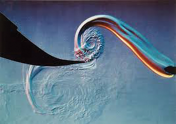
Fig. 13. Harold Eugene Edgerton and Kim Vandiver, Fan Blade Vortex, 1973, vintage color chromogenic print. Image courtesy MIT Museum. © 1973 Kim Vandiver and Harold Edgerton.
-

Fig. 14. Phil Palmer, Wynn Working at Desk in Studio Above Garage, 1968, gelatin silver print. © Phil Palmer.
How then, one might ask, was Bullock’s method for making abstract color photographs distinct from those of his contemporaries? The color light abstractions, like Smith’s refraction prints, are interior works, created in Bullock’s studio above the family’s one-car garage at 155 Mar Vista Drive in Monterey, California (fig. 14). The diagram pictured in fig. 15, from Bullock’s archive at the CCP, contains a sketch of the structure Bullock made to take his photographs. On the right (fig. 16) is the structure itself, recreated by his wife, Edna. Bullock found a piece of wood into which he carved horizontal notches. Into these notches, he placed panes of glass, stacked on top of each other, with a bit of space left in between. Imagine this structure as a vertical spine bookcase, made with shelves of glass instead of wood. Above the shelves he arranged his camera, a 35mm Exakta with a 58mm Zeiss Biotar lens attached to extension bellows.45 Kodak manuals such as Ektachrome-Kodachrome Professional Films (fig. 17) and Printing Color Negatives on Kodak Color Print Material, Type C gave him the technical guidance he needed to photograph in color. In Nathan Lyons’ Photographers on Photography, Bullock describes his working process for making the color light abstractions:
I use a light source (sunlight or tungsten) and direct it on any objects that have an affinity for light, such as water, cellophane, and glass. I use the ground glass of my camera as the painter uses canvas. I know how light reacts to my materials and arrange them roughly in front of the camera’s lens. With this done I begin to move them slowly one way or another, controlling the action of light so as to create the picture desired.46
-

Fig. 15. Diagram of the glass shelf. Photo by the author, courtesy Archives at the Center for Creative Photography, Tucson, AZ.
-
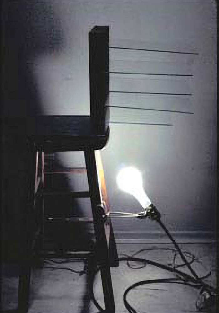
Fig. 16. Edna Bullock’s re-creation of Wynn Bullock’s shelf. Photo by the author, courtesy Archives at the Center for Creative Photography, Tucson, AZ.
-
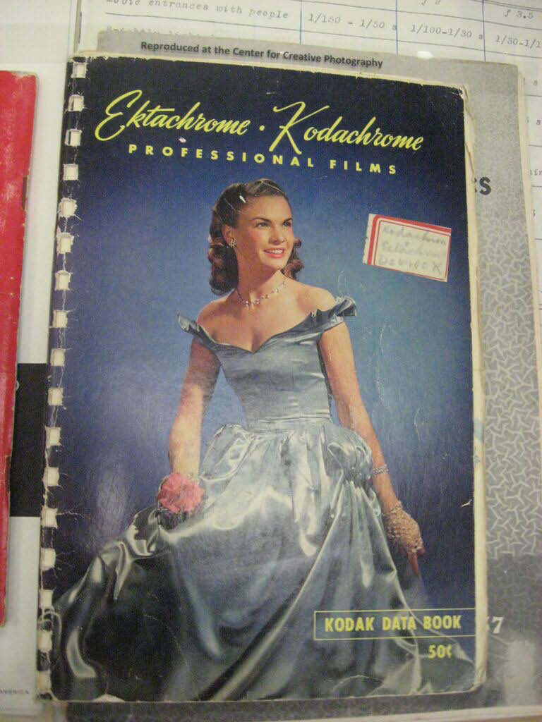
Fig. 17. Wynn Bullock’s Ektachrome-Kodachrome booklet. Photo by the author, courtesy Archives at the Center for Creative Photography, Tucson, AZ.

A collection of 35mm slides from Bullock’s archive at the CCP shows a number of materials that he lists above, including the wrinkled, colored cellophane and bits of glass from the Palomar observatory, which he crushed up and used to reflect and refract light (fig. 18). In the highlighted slides, one will notice Bullock’s glass shelf at the upper right and some of the brightly colored materials he used in the center. It is interesting that he not only used glass to create unique light effects for his color light abstractions but that he also chose to use pieces from an observatory, further highlighting the sense that, with these photographs, one is looking out into space, observing what the naked eye cannot normally see.
There is significant variation in the color light abstractions, especially if one looks at the slides Bullock made in late 1959 and early 1960 versus the ones he made in 1964 or 1965, after he had been experimenting with the method for a few years. His early color light abstractions are left with more open space and draw the viewer’s attention to a single subject of focus. Often, a limited color palette is also used, as seen in fig. 19. Here, the eye is drawn to two arcs of color, filled out in warm tones, which are accentuated with hints of dark purple and blue and surrounded by a black ground. Also, in the early color light abstractions, a clear distinction between layers, created by the spacing between Bullock’s glass shelves, can usually be distinguished. Observe, for instance, how the droplets of liquid on an upper shelf appear to float above a layer of mixed colors beneath it in fig. 20.
In contrast to Color Light Abstraction 1026 (see fig. 19), in 2006 (see fig. 20) Bullock utilizes a fuller range of the ROY-G-BIV spectrum, yet he has still not found a way to depict color as a formal element in its own right. Beginning around 1963, the color light abstractions become denser, as more layers, textures, and colors were added and juxtaposed against one another. Sharper interrelations between colors and forms are stressed in the finished slides.
-
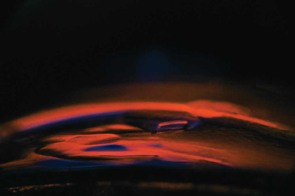
Fig. 19. Wynn Bullock, Color Light Abstraction 1026, 1962, printed 2014, inkjet print. Image courtesy Bulllock Family Photography LLC.
-
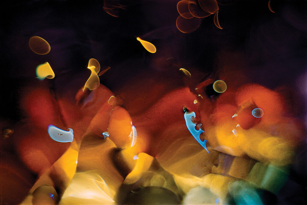
Fig. 20. Wynn Bullock, Color Light Abstraction 2006, 1961, printed 2014, inkjet print. Image courtesy Bullock Family Photography LLC.
Glassy orbs and angular strokes of rich green and red-orange are contrasted against each other, for example, in fig. 21. By 1965, Bullock finds ways to erase the visibility of the layers, yet keeps the interrelations between separate colors and forms, as seen in fig. 22. With this general schematic, one can trace early, middle, and late stages in the development of the color light abstractions. There are moments, though, when Bullock returns to an earlier motif later on, or demonstrates an interest in picturing something that he is only able to fully articulate in visual terms a few years later.
-
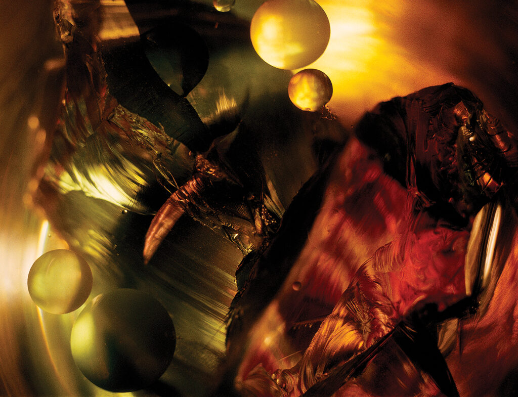
Fig. 21. Wynn Bullock, Color Light Abstraction 1036, 1963, printed 2014, modern inkjet print. Image courtesy Bullock Family Photography LLC.
-
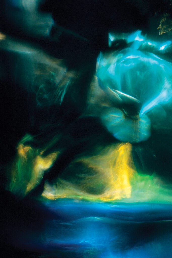
Fig. 22. Wynn Bullock, Color Light Abstraction 1024, 1965, printed 2014, modern inkjet print. Image courtesy Bullock Family Photography LLC.
After Bullock had completed a set of slides, he would show them to his family on their home projector. Fig. 23 shows Abbott’s recreation of the slide show, Bullock’s preferred method for exhibiting the color light abstractions, in a room of Wynn Bullock: Revelations. Bullock’s family viewed the color images in their living room, over popcorn, deciding which orientation was best for each slide.47 It is possible that Bullock liked a slideshow presentation of his work because it would allow viewers to experience the color light abstractions with a greater awareness of the continuum between time and space, further incorporating scientific theories into his photographic practice. When Bullock felt satisfied that he had a collection of slides that were suitable for exhibition, he then started to look for venues where he could speak about his new color works. He presented them in the form of slideshows at MoMA (alongside color abstractions by Francis Thompson, Ernest Haas, Jim Davis, and Scott Hyde),48 at two California colleges, the American Society of Magazine Photographers, the DeCordova Museum, SFMOMA, the Professional Photographers of Northern California, and several local rotary clubs.49 Bullock sent out letters to advertisers, thinking the color light abstractions could be used by “aircraft companies,” for “space age products,” and as ”record covers” for “certain types of music.”50 The color light abstractions were used in the Container Corporation of America’s “Great Ideas” series. They were also published in 1965 in a book called The Widening Stream, which included photographs by Bullock and poems by Richard Mack (fig. 24).
Although almost all of Bullock’s original 35mm Kodachrome slides reside in his archive at the CCP, a few of his chromogenic prints (made via negatives from the 35mm slides) have been acquired by museums and institutions across the United States. Given Bullock’s lack of familiarity with developing color film, he took his negatives to Lawson Jones’ color lab in San Francisco, where they were printed.51 Bullock preferred 8-x-10- or 11-x-14-inch enlargements but had prints made in all sizes, as seen in a photograph of seven of the color chromogenic prints from the High’s collection (fig. 25). The ability to enlarge an image with relative ease was one of the benefits of producing the color light abstractions as 35mm Kodachrome slides.52 Sylvie Pénichon, in Twentieth-Century Photographs: Identification and Care, writes that “Kodachrome transparencies could be enlarged without losing resolution.”53 One of the 8 x 10 prints that Bullock produced is Color Light Abstraction 1075 (fig. 26). Here, Bullock contrasts rich blues and blacks against a bright sweep of orange and yellow that originates from the lower right-hand corner. Blurred spots and streaks in this same orange-yellow hue cluster together at the photograph’s center. These are bordered at the bottom and top by dark black areas, making the orange-yellow cluster stand out. A larger or smaller print of this image would undoubtedly produce a different viewing experience.
-
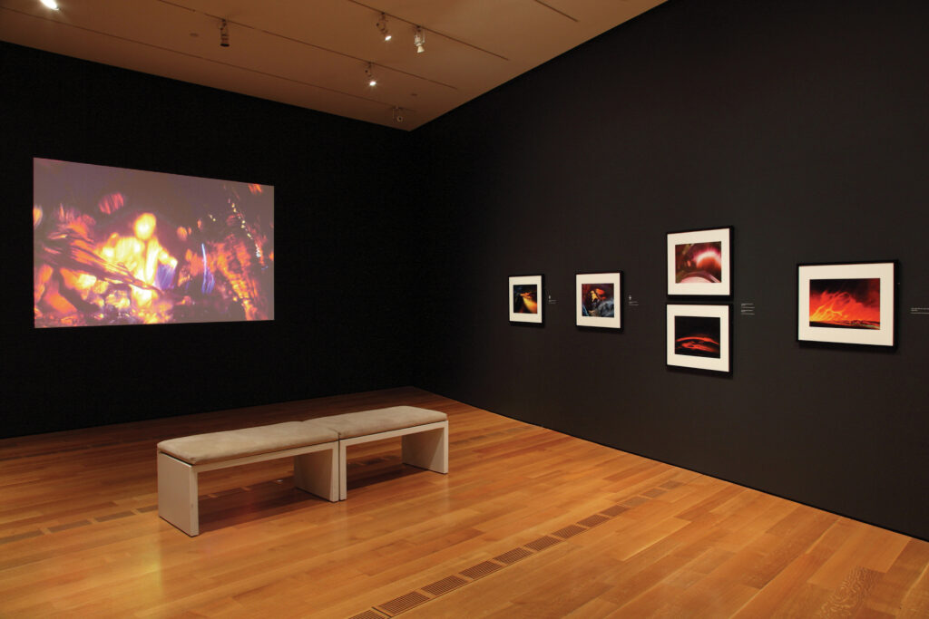
Fig. 23. Gallery view from the High Museum’s 2014 exhibition Wynn Bullock: Revelations. Source: High Museum of Art.
-
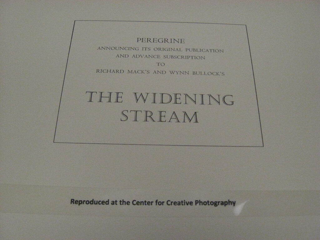
Fig. 24. Cover page from The Widening Stream. Photo by the author, courtesy Archives at the Center for Creative Photography, Tucson, AZ.
-
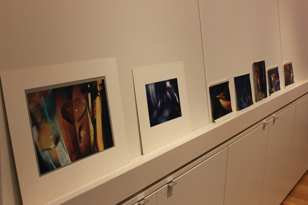
Fig. 25. Bullock’s vintage color light abstractions from the High Museum’s collection. Photo by the author.
-
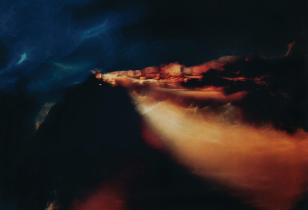
Fig. 26. Wynn Bullock, Color Light Abstraction 1075, early 1960s, dye coupler print, High Museum of Art, promised gift of Barbara and Gene Bullock-Wilson. Photo by Mike Jensen.
In assessing the condition of a fifty-year-old chromogenic print such as this, color fading is usually quite evident to the human eye. We can see some slight color fading in this print, though I would not say that it lessens the intensity of effect. What is often not as visible at first is color shifting, which indicates a loss of tonal range, in that secondary and tertiary colors will no longer be visible in the print. At the CCP, Senior Photograph Conservator Jae Gutierrez examined a set of Bullock’s color light abstractions from their collection and found minimal to no color shifting and moderate fading, though this can vary from print to print in a collection and is based on conditions of storage and inherent vice.54 Bullock’s Kodak Type-C chromogenic prints were also made on a fiber base support.55 We know from the back print “A Kodak Paper” on 1075 and others that the photographs in the High’s collection were printed between 1961 and 1972, according to a recent study by Gawain Weaver and Zach Long on “Chromogenic Characterization: A Study of Kodak Color Prints, 1942–2008” (fig. 27).56 Letters from the Kodak Historical Collection in the archives at the University of Rochester also confirm that photographs printed on paper with the “A Kodak Paper” back print were not produced until 1961.57
A profile view of Color Light Abstraction 1075 shows that the emulsion layer is curling in, causing the paper support to curl in as well (fig. 28). This tug of war between image and support creates undulations in the surface of the photograph, easily seen from this perspective. A blue line just outside the photographic image of Color Light Abstraction 1185, another print from the High’s collection, serves as evidence that this print was once matted and framed (fig. 29).58 In addition, a number of the vintage prints at the High and elsewhere are trimmed and mounted, such as the one in fig. 30, while others are unmounted and housed in plastic sleeves. The mounted prints have aged without wrinkles and have not developed the surface undulations of the unmounted prints. Finally, Wynn Bullock’s signature distinctively marks each of the vintage color chromogenic prints on the lower right-hand corner, as shown in fig. 31.
-

Fig. 28. Side view of color light abstraction. Photo by the author.
-
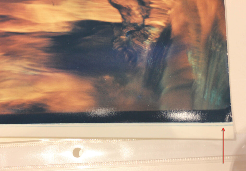
Fig. 29. Detail on recto of a color light abstraction. Photo by the author.
-

Fig. 30. Wynn Bullock, Color Light Abstraction 1006, 1961, dye coupler print, High Museum of Art, promised gift of Barbara and Gene Bullock-Wilson. Photo by Mike Jensen.
-

Fig. 31. Detail of signature on a color light abstraction. Photo by the author.
When I wrote to John Rohrbach, Senior Curator of Photographs at the Amon Carter Museum, to ask for his opinion on the best way to house and exhibit these prints, he made a number of recommendations. The Amon Carter, which owns two of Bullock’s color chromogenic prints, stores them in a cold vault, at twenty degrees Fahrenheit with thirty percent relative humidity. Dr. Rohrbach exhibited one of the prints in his 2013 show Color! American Photography Transformed, and the conservation staff measured light levels in the print before and after it went on exhibition. In his e-mail back to me, Dr. Rohrbach wrote: “We learned that early vintage color prints will change slightly over the course of even 6 months display at 5-foot candles. Displaying early chromogenic prints should be handled on a case-by-case basis, but in general, [our] experience suggests that we should cut the display of early color prints to 3 months.”59 After exhibition, they noticed very modest fading and shifting in the color light abstraction, but no change that could be seen by the naked eye.60 A good way to measure changes in light levels and color fading or shifting in prints is to use a program called CIE Lab Color Space, an application that is currently used by the photographs conservation staff at the Amon Carter Museum and the Metropolitan Museum of Art.61
Fading and shifting in Bullock’s original color chromogenic photographs is most visible when the prints are viewed side by side with the modern inkjet prints produced by the estate. One such example is Color Light Abstraction 1071 (figs. 32–33) from the High’s collection, in both modern inkjet and vintage color chromogenic versions. To make new inkjet prints, the estate drum scanned the original 35mm Kodachrome slides, color corrected them digitally, and then printed them.62 The difference in intensity of color is significant in this comparison. In the vintage print, the yellows and reds have faded, and some of the blues in the print now look more purple. In the bottom left-hand corner of each print, two blue streaks of color are visible. In the vintage print, these streaks are a darker, cooler blue, yet in the modern print they are brighter, more turquoise. A more dramatic change in color can be seen, however, in the sworl just below the red and orange burst at the center of the photograph.
-
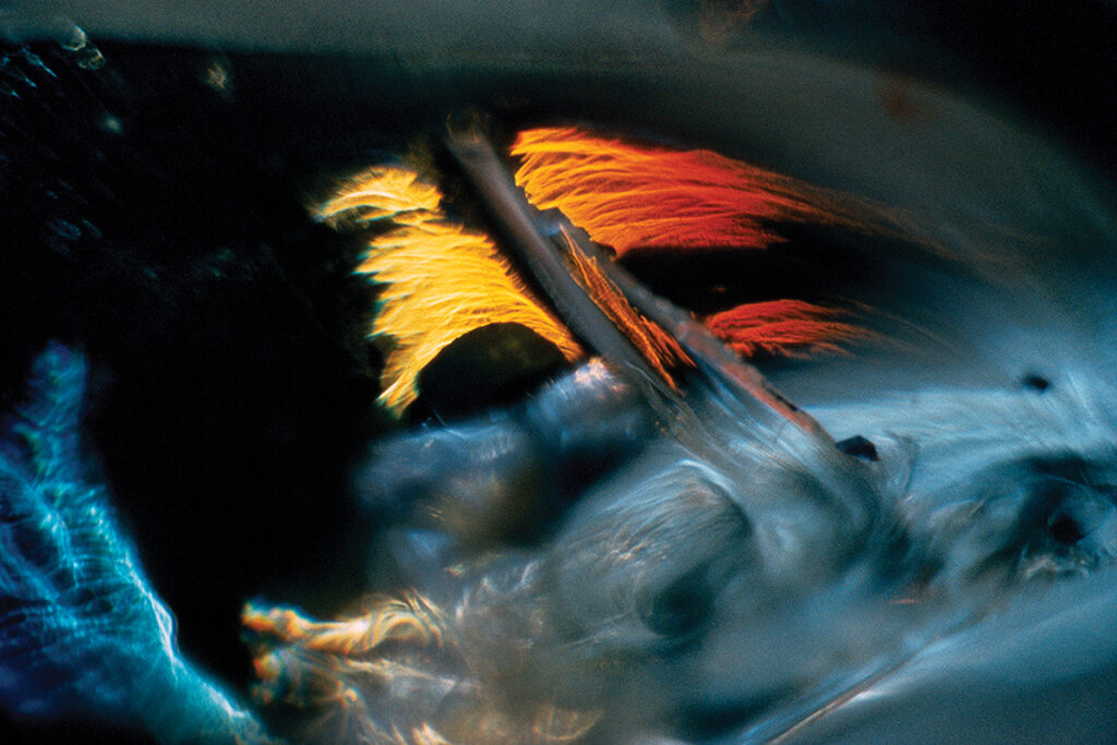
Fig. 32. Wynn Bullock, Color Light Abstraction 1071, 1960, printed 2014, modern inkjet print. Image courtesy Bullock Family Photography LLC.
-
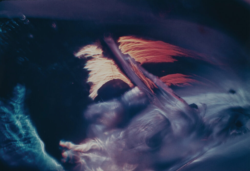
Fig. 33. Wynn Bullock, Color Light Abstraction 1071, 1960, dye coupler print, High Museum of Art, promised gift of Barbara and Gene Bullock-Wilson. Photo by Mike Jensen.
This part looks purple in the vintage print, while in the modern print the area retains a blue hue. The color change in this area is likely an example of color shifting, where the cyan layer of the print has deteriorated or been reduced over time.63 Instead of seeing the original bright blue in the vintage print, which is visible in the modern inkjet print, the viewer sees dark blue and purple. Despite these differences, each print retains a distinctive mood or character. The modern print is vibrant, animated by color, while the vintage print carries with it a soft, timeless beauty.
After completing my research on Bullock, his influences, and his methods of producing the color light abstractions, one question still remained with me: What was it about color that so attracted Bullock in the first place? Why did he choose to represent the power of light in photography through color and not through the traditional tonal range of black and white? What did color allow him to express that black and white could not? Clearly, he found something special about what color could produce in a photograph. Most likely, he felt that color in slides and prints would best emulate the full properties of light—its wavelength, frequency, and radiance—that he wanted to convey in the aesthetic message behind his color light abstractions. Yet in 1966 he returned to working in black and white and continued to do so for th rest of his career. By 1971, he had concluded: “Most all of my experimental photographs were made only to investigate various darkroom techniques. Once having done a few I had no desire to further develop the techniques. These are kept more for study.”64 Indeed, the color light abstractions are now labeled as study prints in Bullock’s archive at the CCP, housed with his papers and excluded from the Core Collection of master prints.65 It is hard to believe that the same photographer who wrote so eagerly to Pollock in 1965 about the potential of color photography had, by the following year, given it up entirely. Technical and financial constraints probably contributed to this decision. It was not only difficult for Bullock to produce color prints, but the audience for fine art color photography had not grown enough by the early 1960s, and his slideshows were not a permanent vehicle for these works. However, it is apparent that the color light abstractions were tied to Bullock’s larger aesthetic goals of creating a new grammar of photography, defined by time, space, line, form, and color. With his intricate glass shelf and colored materials, Bullock fashioned an inner world in which color was electrified through the action of light. By following the recommendations of scholars and professionals, these photographs may be preserved as rare documents of a highly experimental moment in color photography. Furthermore, they stand as representatives of a crucial moment in the career of one of America’s most innovative modern photographers.
—Catherine Barth, Emory University, Andrew W. Mellon Foundation Graduate Fellowship Program in Object-Centered Curatorial Research, 2014
Selected Bibliography
Abbott, Brett, Barbara Bullock-Wilson, and Maria Kelly. Wynn Bullock: Revelations. Atlanta: High Museum of Art, 2014.
Bullock, Wynn. Wynn Bullock. Millerton, NY: Aperture, 1976.
———. Photographing the Nude: The Beginnings of a Quest for Meaning. Edited by Barbara Bullock-Wilson and Edna Bullock. Salt Lake City: Peregrine Smith Books, 1984.
———. “Space and Time.” In Photographers on Photography: A Critical Anthology. Edited by Nathan Lyons. Englewood Cliffs, NJ: Prentice-Hall Inc., 1966.
———. Wynn Bullock: Color Light Abstractions. Edited by Barbara Bullock-Wilson, with contributions by A. D. Coleman, Richard Gadd, Chris Johnson, Britt Salvesen, Karen Sinsheimer, and Michael Spencer. Carmel, CA: Bullock Family Photography, 2010.
———. Wynn Bullock: Realities and Metaphors. Edited by Laurence Miller. New York: Laurence Miller Gallery, 2001.
Bullock, Wynn, and Barbara Bullock-Wilson. Wynn Bullock Photography: A Way of Life. Edited by Liliane DeCock-Morgan. Dobbs Ferry, NY: Morgan & Morgan, Inc., 1973.
Bullock-Wilson, Barbara. “Wynn Bullock’s Color Light Abstractions.” Working Document, Carmel, CA, July 2014.
Bunnell, Peter, ed. Aperture Magazine Anthology: The Minor White Years, 1952–1976. New York, NY: Aperture Foundation, 2012.
Callahan, Harry M., Sally Stein, and Terence Pitts. Harry Callahan: Photographs in Color: The Years 1946–1978. Tucson, AZ: The Center for Creative Photography, University of Arizona, 1980.
Edgerton, Harold Eugene. Moments of Vision: The Stroboscopic Revolution in Photography. Cambridge, MA: MIT Press, 1979.
Eggleston, William, and John Szarkowski, William Eggleston’s Guide. New York: Museum of Modern Art, 1976.
Greenberg, Clement. Clement Greenberg: The Collected Essays and Criticism. Vol. 3, Affirmations and Refusals, 1950–1956. Edited by John O’Brian. Chicago: University of Chicago Press, 1993.
Horenstein, Henry, and Russell Hart. Color Photography: A Working Manual. Boston: Little Brown, 1995.
Jeffers, Robinson. Rock and Hawk: A Selection of Shorter Poems by Robinson Jeffers. Edited by Robert Hass. New York: Random House, 1987.
Johnson, Chris, and Barbara Bullock-Wilson. Wynn Bullock. London: Phaidon Press, 2001.
Kennel, Sarah, Diane Waggoner, and Alice Carver-Kubik. In the Darkroom: An Illustrated Guide to Photographic Processes before the Digital Age. New York: Thames & Hudson, 2010.
Kodak Historical Collection. University of Rochester, Rochester, NY.
Moholy-Nagy, László. “Light: A Medium of Plastic Expression: From Pigment to Light.” In Photographers on Photography: A Critical Anthology. Edited by Nathan Lyons. Englewood Cliffs, NJ: Prentice-Hall Inc., 1966.
Moore, Kevin D., James Crump, and Leo Rubinfien. Starburst: Color Photography in America, 1970–1980. Ostfildern: Hatje Cantz, 2010.
Museum of Contemporary Photography, Columbia College Chicago. “Henry Holmes Smith.” Accessed May 2, 2014. http://www.mocp.org/detail.php?type=related&kv=7705&t=people.
Outerbridge, Paul. Photographing in Color. New York: Random House, Inc., 1940.
Pénichon, Sylvie. Twentieth-Century Color Photographs: Identification and Care. Los Angeles, CA: Getty Conservation Institute, 2013.
Rexer, Lyle. The Edge of Vision: The Rise of Abstraction in Photography. New York: Aperture, 2009.
Rohrbach, John, and Sylvie Pénichon. Color: American Photography Transformed. Austin: University of Texas Press, 2013.
Smith, Henry Holmes. “Speaking with a Genuine Voice,” Image 16 (1973): 1–6.
Stein, Donna. Thomas Wilfred: Lumia, A Retrospective Exhibition. Washington, DC: Corcoran Gallery of Art, 1971.
Weaver, Gawain, and Zach Long. “Chromogenic Characterization: A Study of Kodak Color Prints, 1942–2008.” George Eastman House: Notes on Photographs. Accessed November 1, 2014. http://notesonphotographs.org/index.php?title=Weaver,_Gawain_and_Zach_Long._Chromogenic_Characterization:_A_Study_of_Kodak_Color_Prints,_1942-2008.
Whitehead, Alfred North. Science and the Modern World. New York: Free Press, 1967.
Wynn Bullock Archive. Center for Creative Photography. University of Arizona, Tucson, AZ.